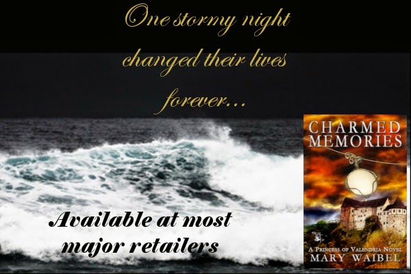
I am trying to make some images to share for the books in my Princess of Valendria series. One liners and an image that make you go, "Yeah, I want to read that!"
But, I need your help. I am going to share three different images for Charmed Memories. What I'd like is for you to tell me in the comments what you like (or don't like) about them, and which one is your favorite. Thanks!!!
A)
B)
C)
D)
E)
F)
G)


I like the third from the bottom. I like the lightning more than the waves (though both are compelling) because of the suggestion that one stormy night changed things. And lightning will certainly do that. I prefer that to the next two, because it focuses on the book and suggests where you can buy it.
ReplyDeleteThanks so much for the feedback, Elizabeth.
DeleteI like E best. The scroll font is too hard to read on the black back ground. The lightning is a better companion to 'one stormy night', plus it draws the eye more. For some reason I like 'available at most major retailers' a lot even though it is too open ended. Logically, F is better because it points interested readers to your site. But you know I'm not always logical!
ReplyDeleteThanks Kai.That helps a lot!
DeleteI like F. LIghtning and your website. The script at the top is a bit difficult to read. Can you make it bigger? Is it the same font as your website addy? That seems clearer.
ReplyDelete